So, one of the things that makes cancer frightening is that you often don't know it's there.
Some cancers can develop without obvious symptoms, which is why things like regular checks and screening can be
so important. I started thinking about this idea of something being hidden beneath the surface. That led to the
main
interaction: I wanted the user to have to search for the cancer.
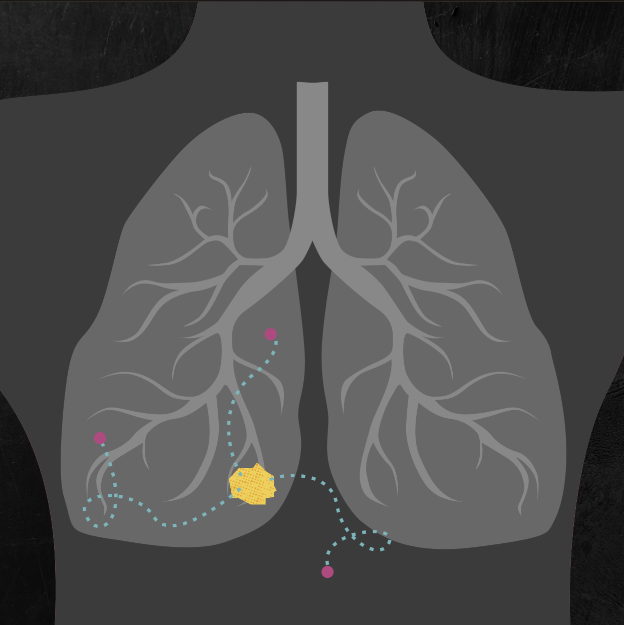
Rather than immediately showing the user where the cancer was, I made them explore the body using an x-ray. As
the
cursor moves around, the inside of the body is gradually revealed. Eventually, the user will discover the
brightly
coloured cancer hidden within it.
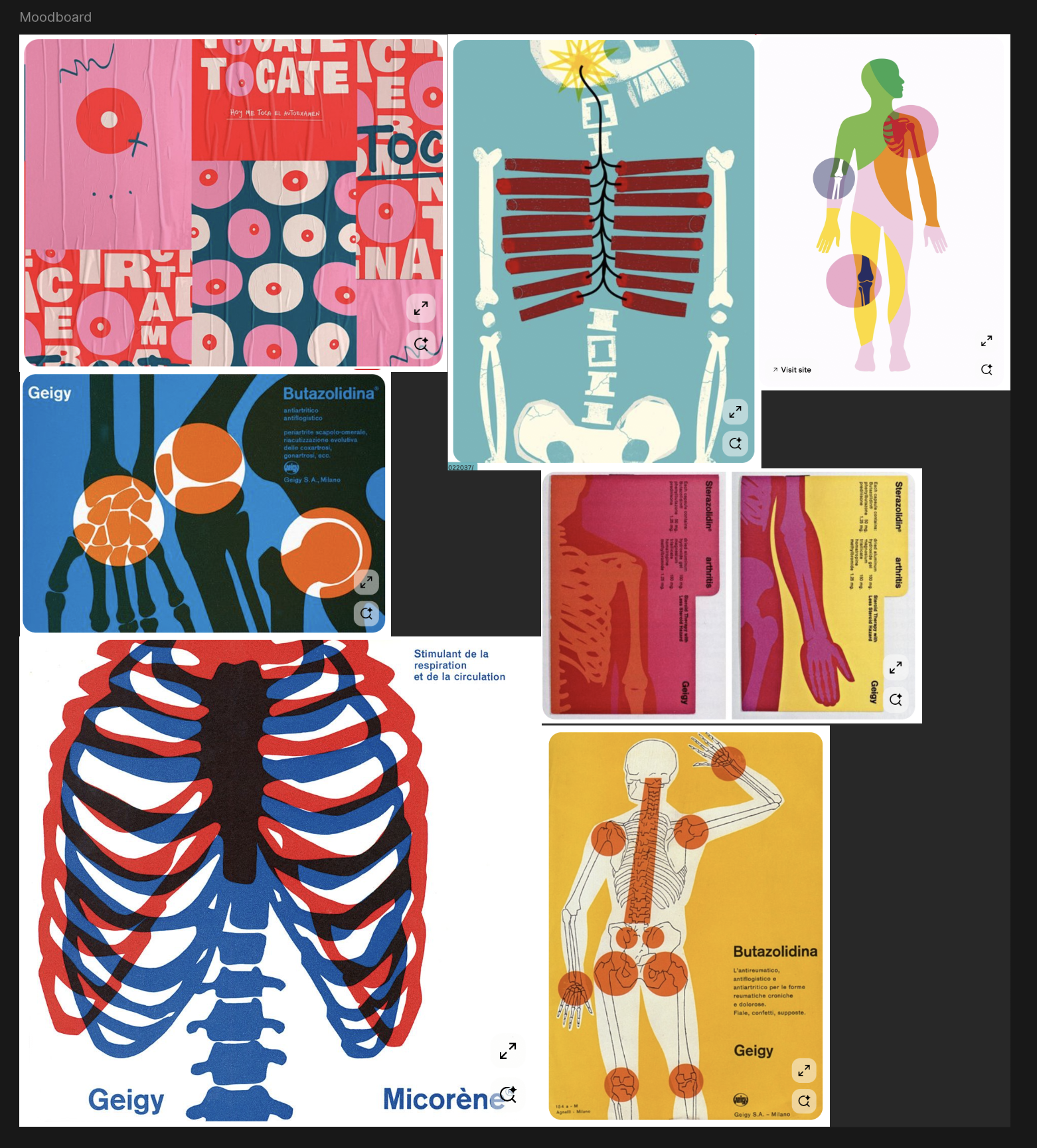
I knew quite early on that I didn't want this to look like a typical medical website.
A lot of medical information is presented in a very clean, clinical way, which makes sense, but I wanted to create something that felt a little more human and inviting. The subject is already quite heavy, so I wanted the visual style to encourage people to explore it rather than making it feel even more intimidating.
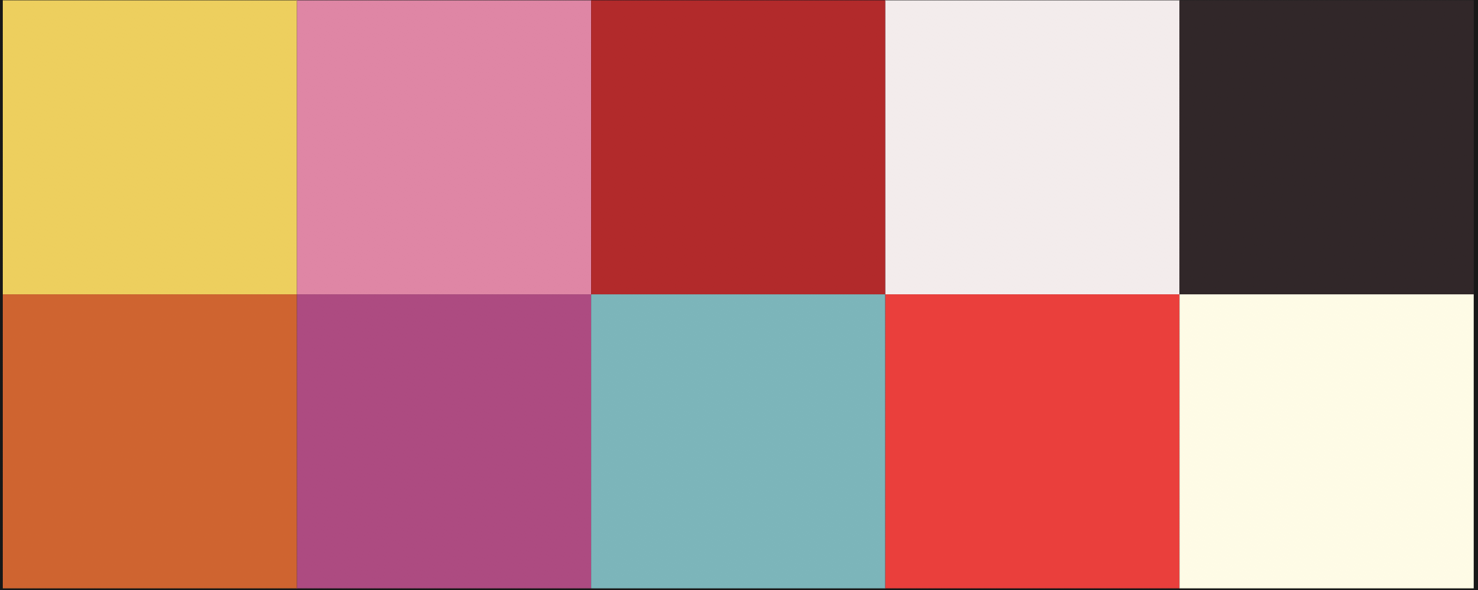
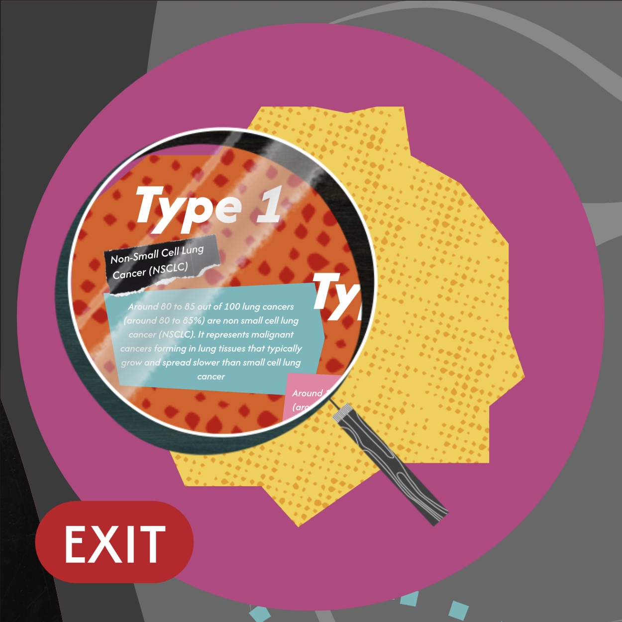
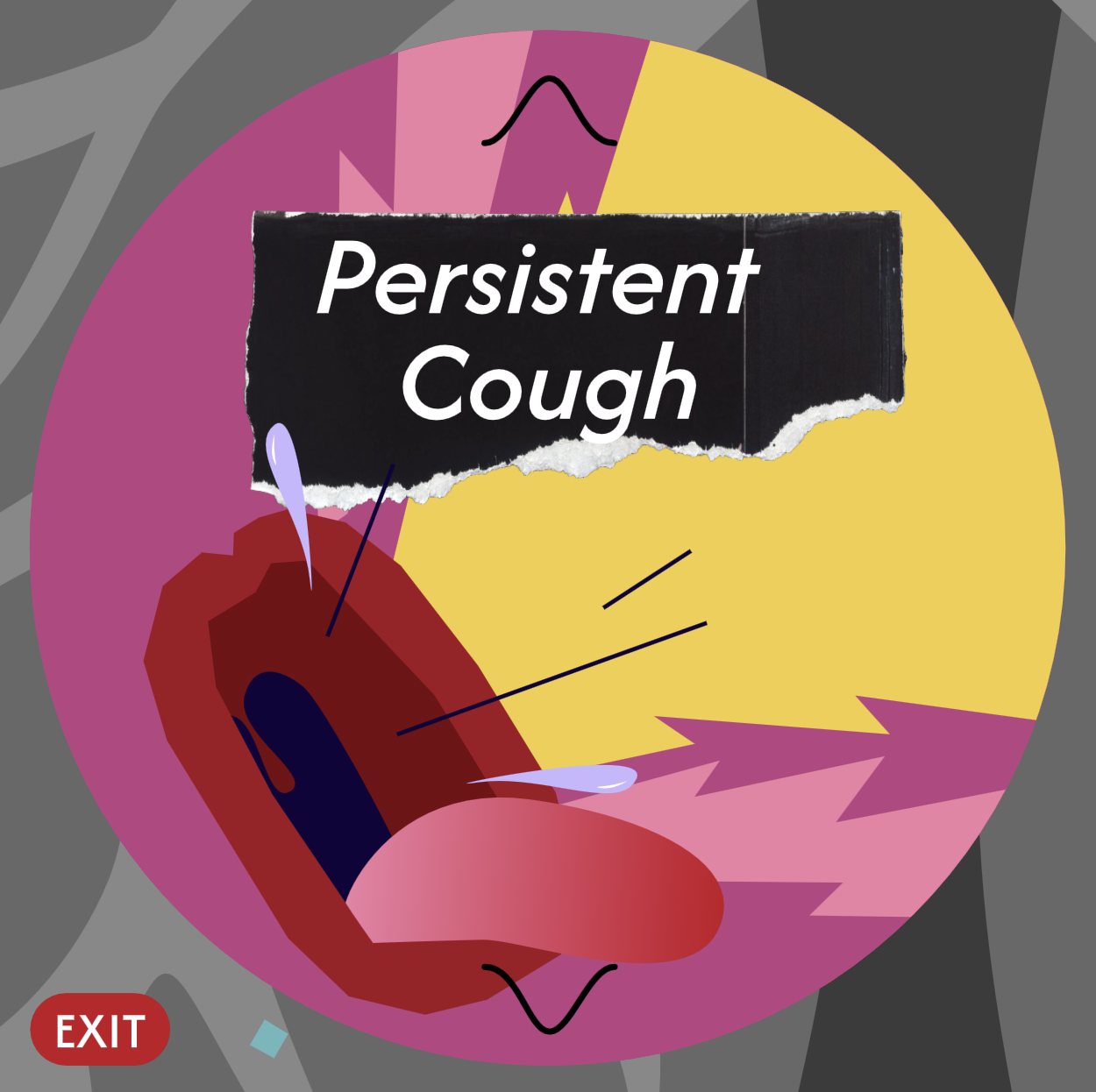
I started playing with collage, torn paper, halftone textures and bold vector illustrations. The bright yellows, pinks and blues give the pages a sense of energy, while the darker x-ray imagery creates a strong contrast and keeps bringing the user back to the idea of looking beneath the surface.
The colour also became a useful way of highlighting the important parts of the interaction. Against the muted x-ray, the cancer immediately stands out, making it feel like something you've discovered.
Although each cancer has its own layout and colour emphasis, I kept the same visual ingredients throughout. This gave me enough freedom to make each page feel different, while still making it obvious that they belong to the same project.
The three pages also became a progression in how I approached Rive.
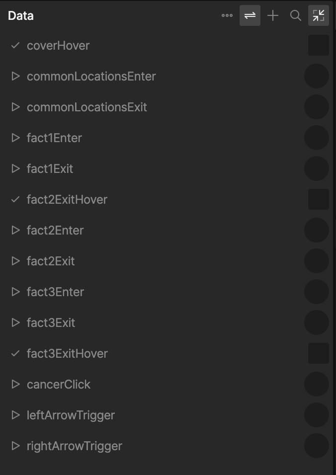
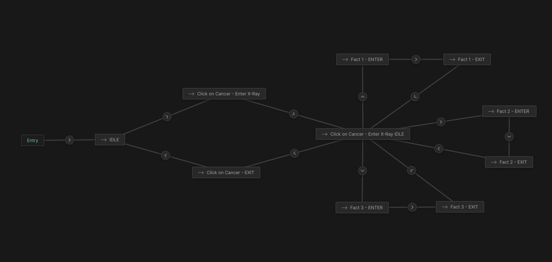
Breast cancer was the starting point. It was my first experience building a project like this in Rive, so I was mainly figuring out how the different pieces worked and getting comfortable with State Machines, listeners and interactive states.
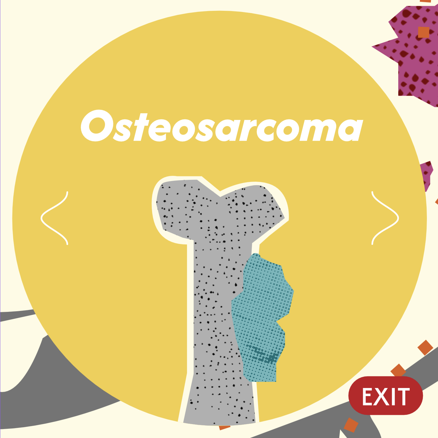
Bone cancer came next. I was able to take what I'd learned from the first page and start pushing the interactions further. I became more confident with the animation and started introducing more interactive elements.
By the time I reached lung cancer, I was much more comfortable experimenting. I started using more complex interactions, including lists and data binding, and felt more confident designing the experience around what the user could do rather than just what they could see.
Looking back at the three pages, you can see that progression quite clearly. The visual design becomes more confident, the interactions become more ambitious, and my understanding of Rive develops alongside the project.
The learning curve was definitely one of the biggest challenges. I was already comfortable with design and animation, but Rive introduced a more technical way of thinking. State Machines, overlapping timelines, listeners and data binding all took some time to wrap my head around.
That was also one of the most rewarding parts of the project. Each page gave me something new to learn, which I could carry into the next one and use to make the experience more ambitious.