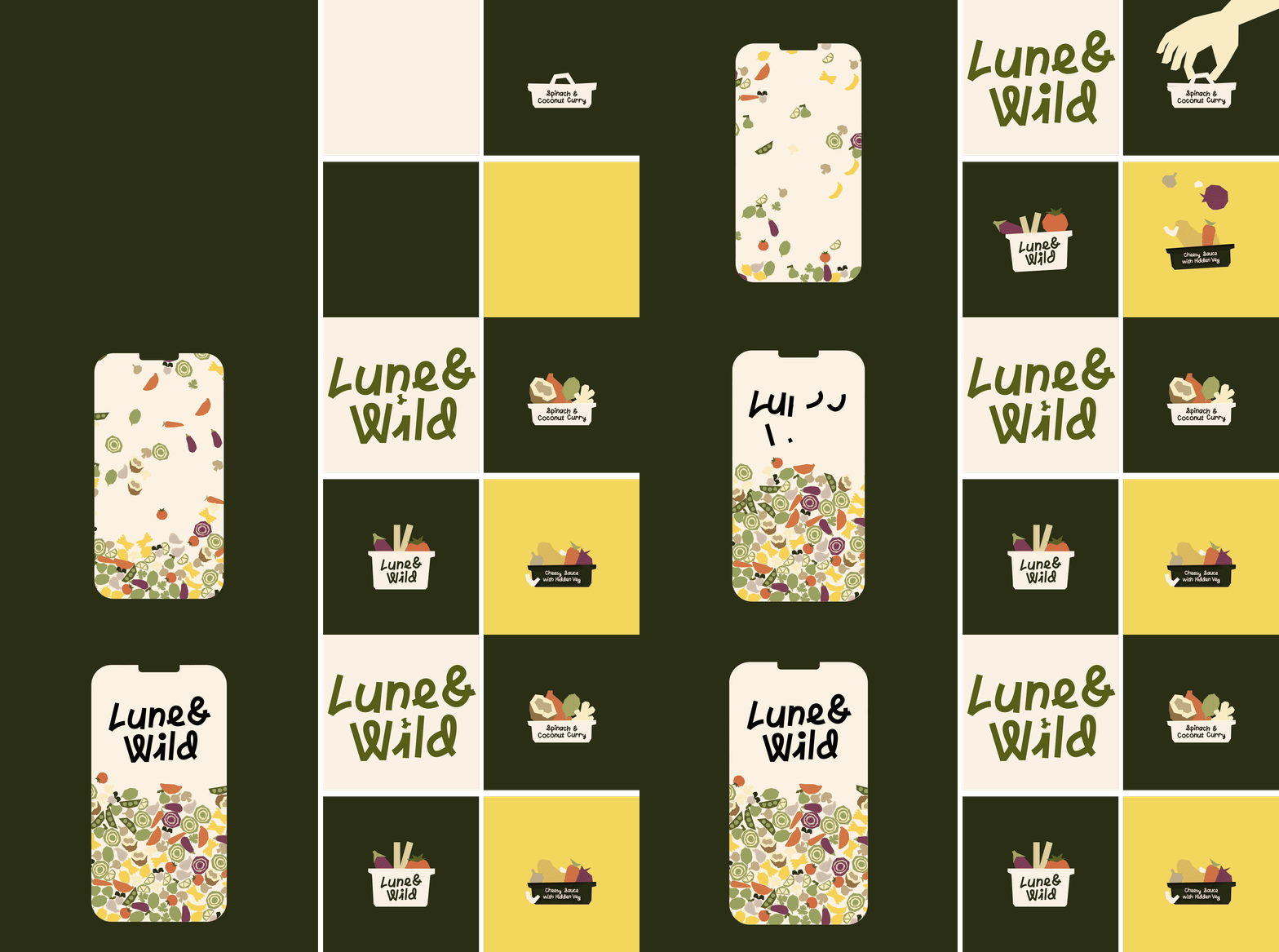
This project was primarily an opportunity to challenge myself as a motion designer.
Rather than starting with a client brief or a defined set of requirements, I set myself the challenge of
taking an
existing brand identity and finding a way to extend its visual language through motion without compromising
what made the identity work in the first place.
I wanted to push myself to think beyond simply animating individual elements and instead consider how
movement could become part of the brand expression itself — exploring rhythm, timing, transitions and
composition to create something that felt intentional and connected to the original identity.
I also used the project as an opportunity to step further outside my usual workflow and get more comfortable
working in Cavalry. With no client constraints or expectations, I could experiment, make mistakes and
iterate freely,
using the project as a space to develop new techniques and broaden my motion design toolkit.

I approached the project by looking closely at the existing identity and identifying the visual
characteristics that
could naturally translate into motion. Rather than introducing a completely new visual language, I wanted
the
animation to feel like an extension of the brand itself.
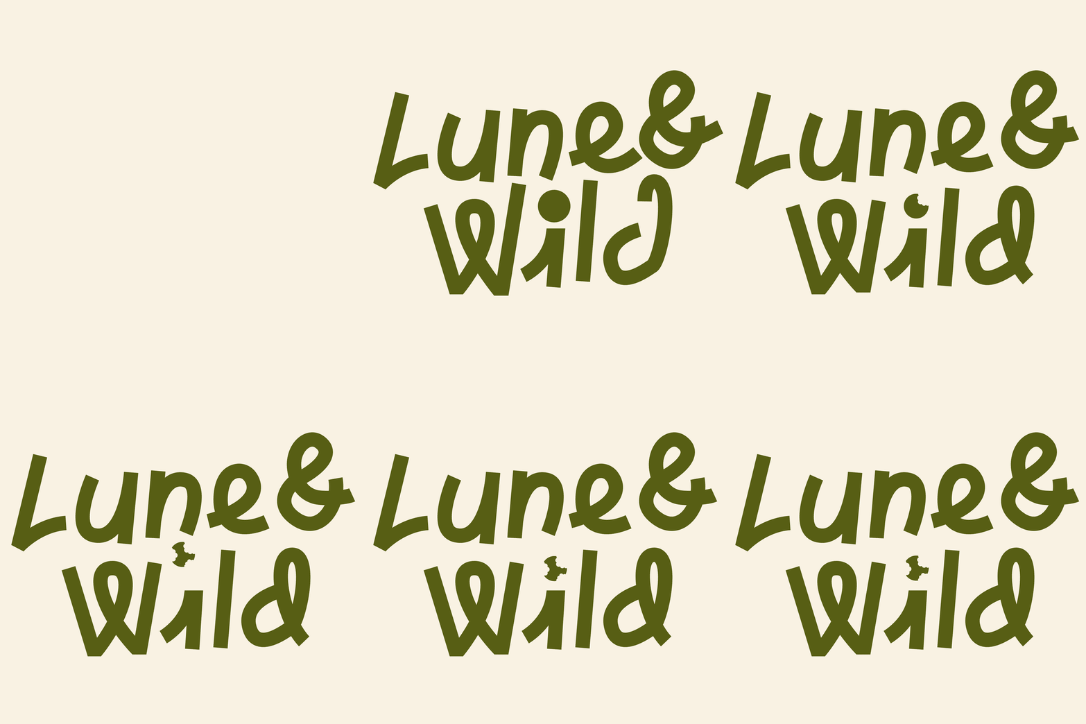
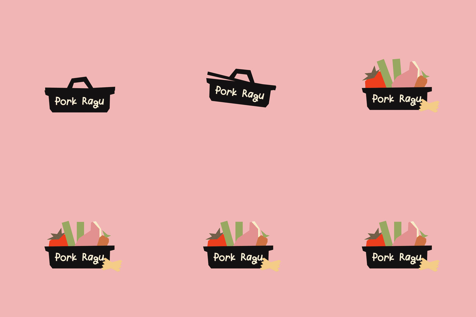
I explored how the identity's shapes, typography and graphic elements could move, interact and transition
between one another. This became less about adding movement for the sake of it and more about finding a
consistent motion language that felt playful, considered and true to the original design.
Through experimentation and iteration in Cavalry, I developed a series of transitions and behaviours that
allowed
the individual brand elements to work together as a cohesive sequence. The result was a motion concept that
builds on the existing identity while giving it a new dimension through movement.